Marketplace
Bidadoo asked for a redesign to lift conversion. We started with the behavior behind the friction, then rebuilt search, filtering, mobile, and the eBay handoff around how buyers actually move — sitewide, in 10 weeks.
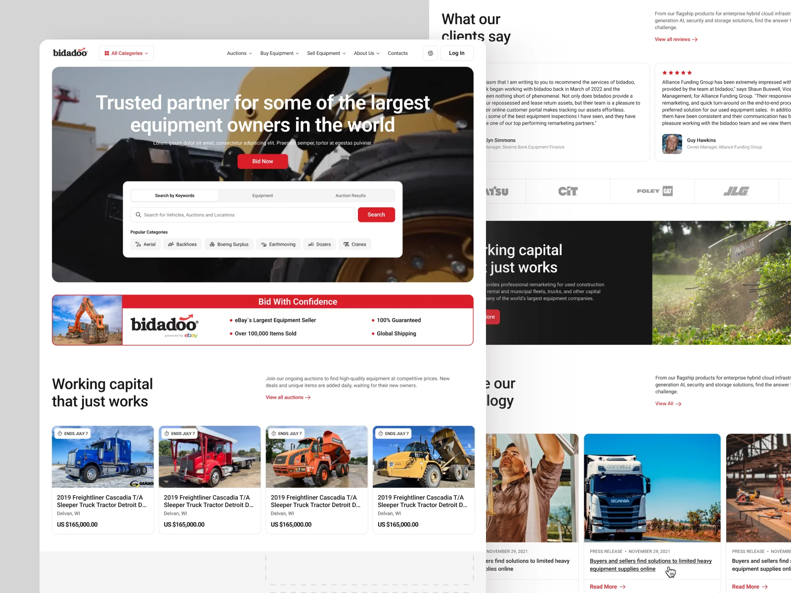
A seller-first marketplace for heavy equipment, trucks and industrial assets: weekly no-reserve auctions plus a Buy It Now experience. Bidding settles on eBay, but Bidadoo owns the discovery layer — helping buyers search, filter and evaluate equipment before the handoff.
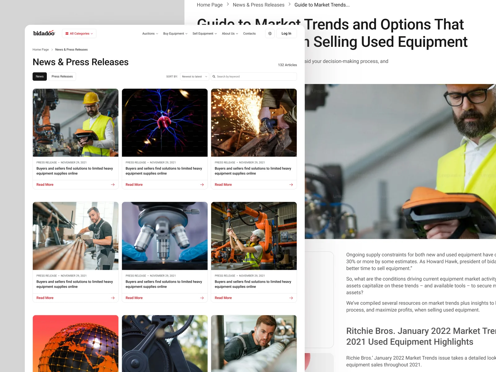
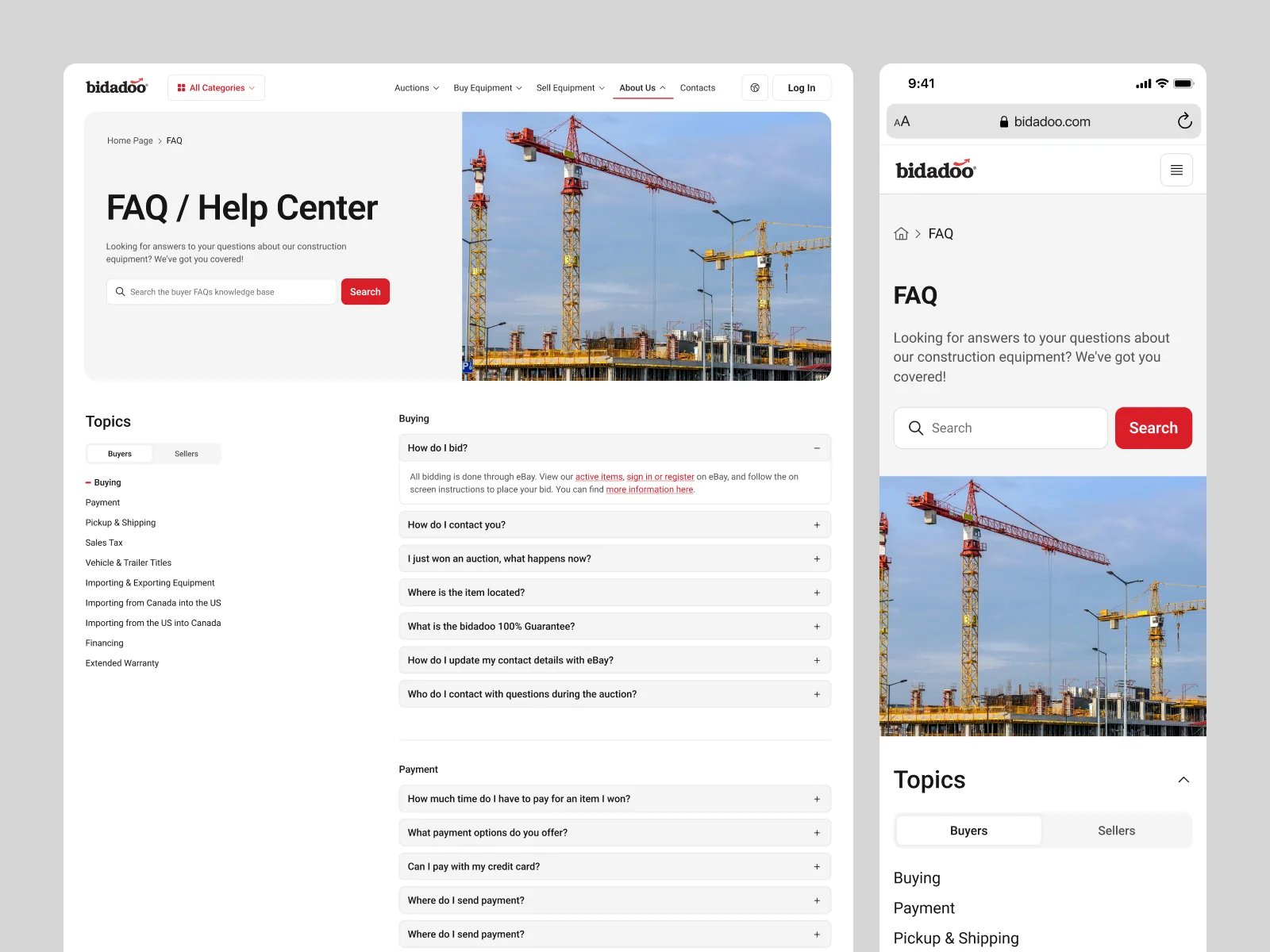
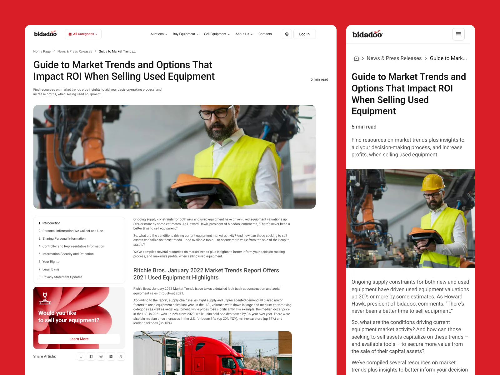
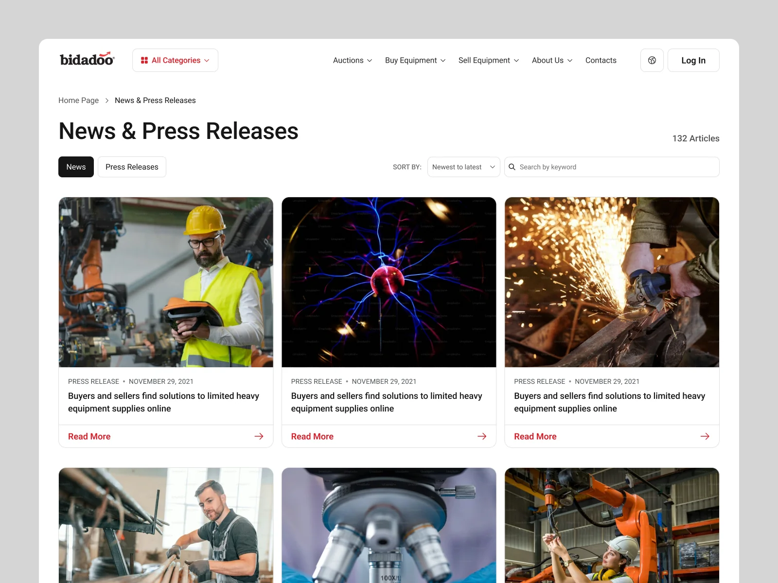
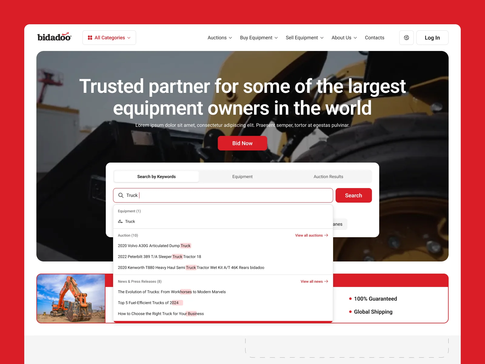
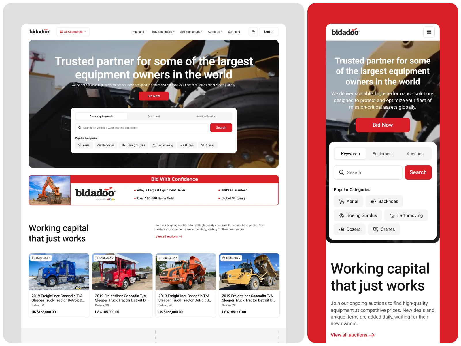
"Improve conversion" was the brief; the actual friction wasn't defined. The marketplace had unclear hierarchy and inconsistent navigation, weak search (no suggestions, Enter didn't work, a hard-to-scan "No results"), and filtering that didn't match how people browsed. Clicking a lot threw buyers straight to eBay — an abrupt jump out of Bidadoo's environment. And most traffic was mobile, where the experience was weakest.
We began with behavior, not visuals: analytics, user patterns, and competitor flows. The redesign was shaped around what buyers were already trying to do — enter, find, narrow, evaluate, and decide whether to bid or buy.

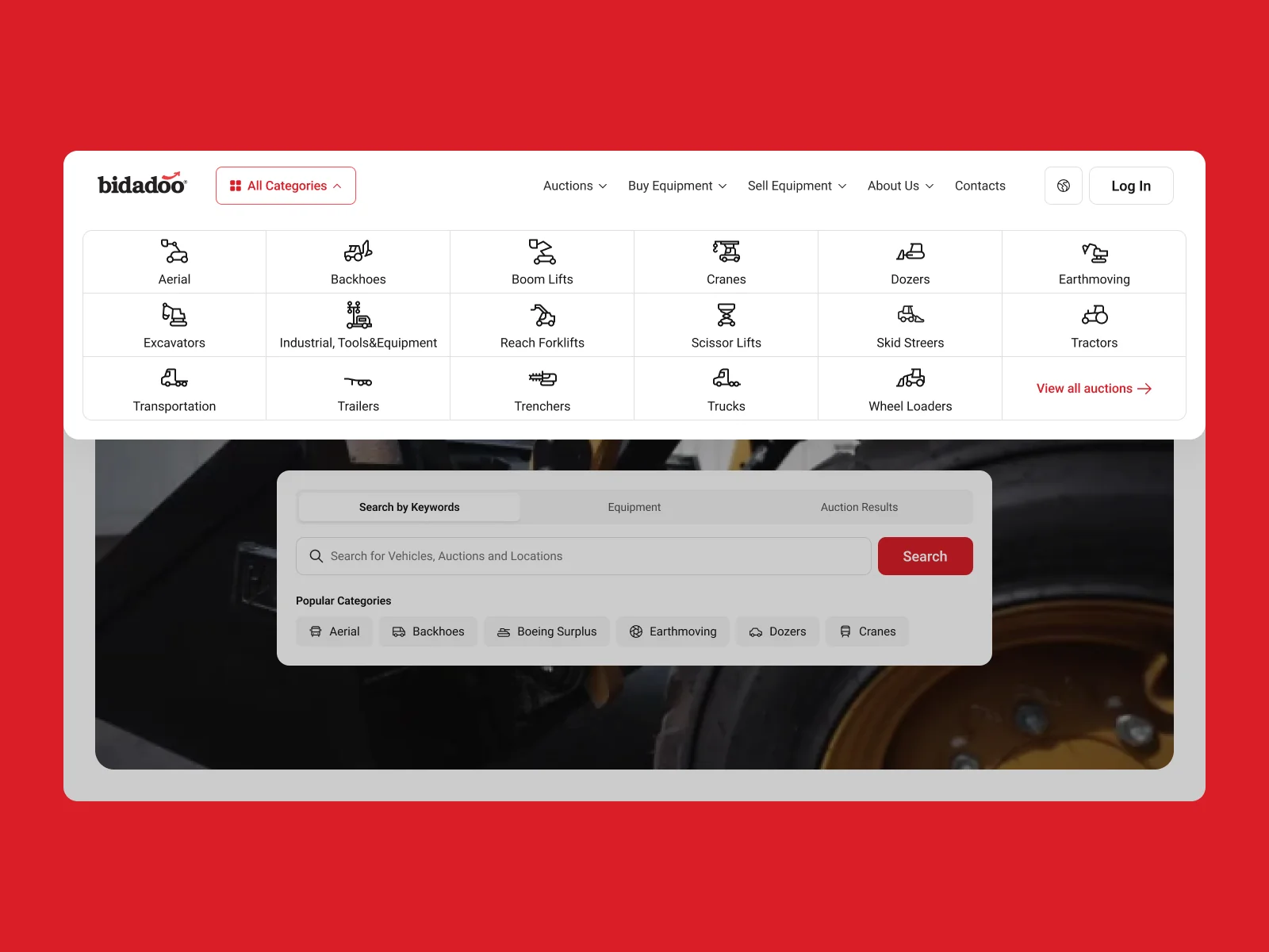
Search moved to the center of the first screen for high-intent buyers — find equipment by type, category and buying format from the very first interaction, instead of decoding a brand page first.

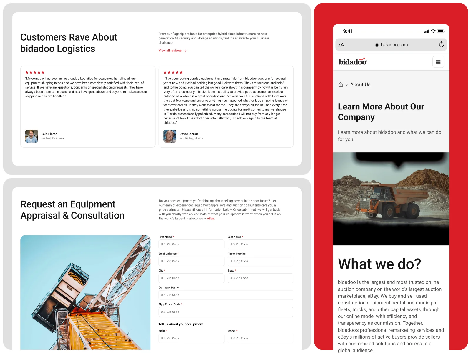
Credibility built into the journey: eBay partnership, guarantee messaging, global shipping, testimonials, partner logos and a clear "how it works" — lowering the perceived risk of buying heavy equipment online.

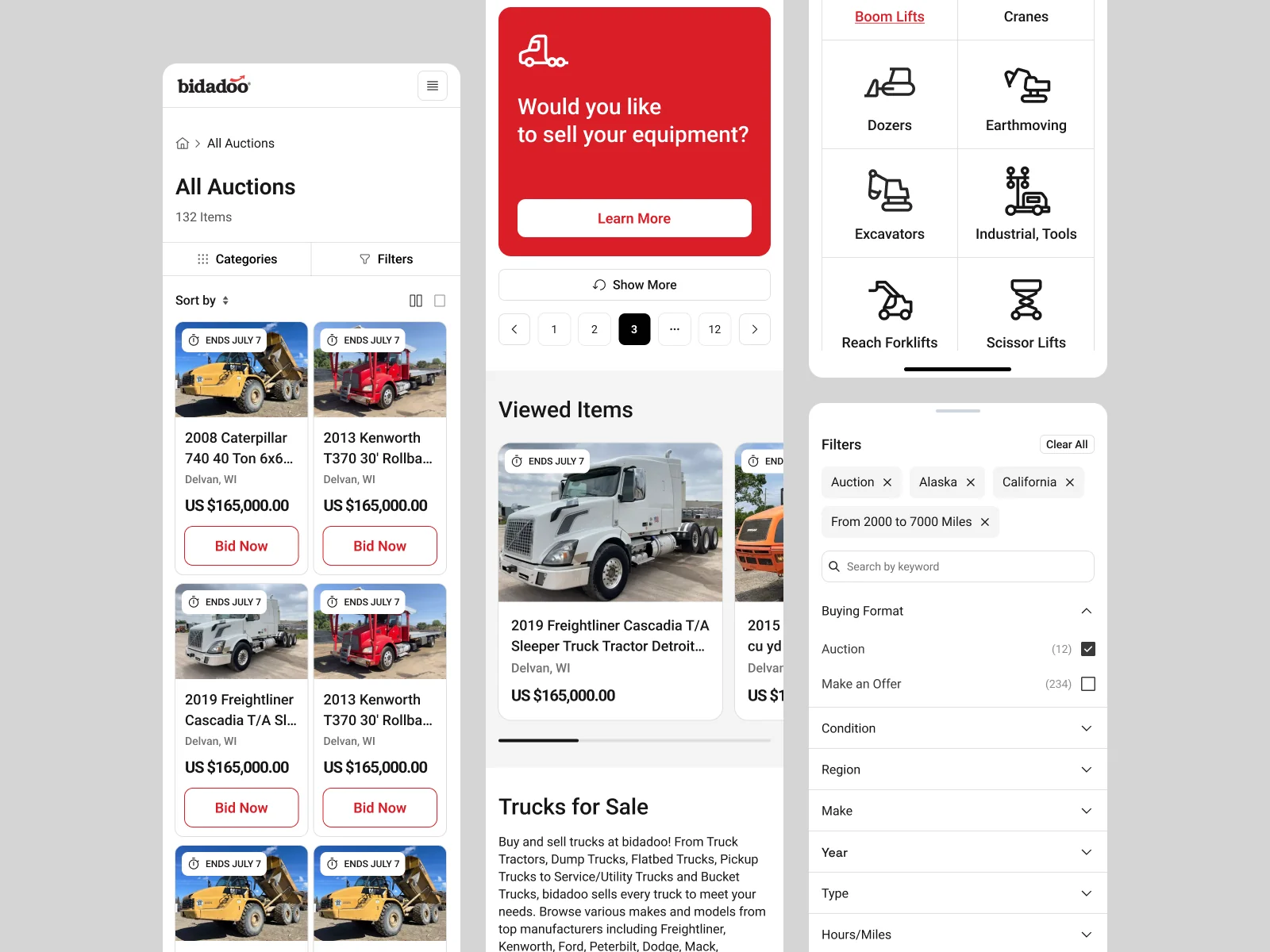
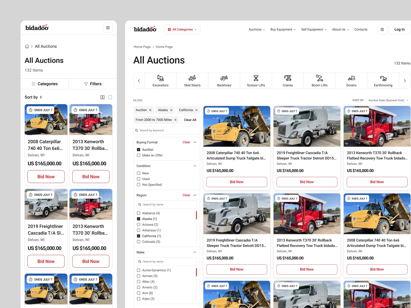
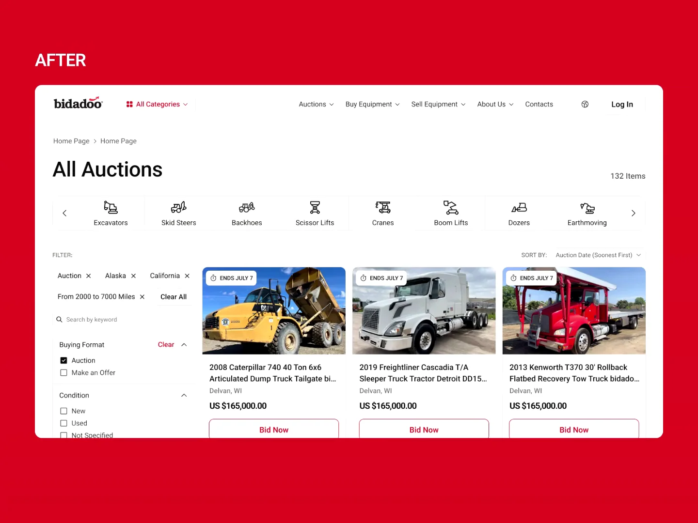
Easier access to the criteria buyers actually used — with buying format (auction vs Buy It Now) front and center — plus smarter search with categories, types, and suggestions.

Not a shrunk desktop: large tap targets, clear structure, filters in a dedicated panel, switchable catalog views, and scannable icons — built for buyers searching on the go.

A new controlled decision point inside Bidadoo — gallery, condition, specs, delivery and legal — with an explicit "next step happens on eBay" block, turning an abrupt redirect into a predictable step.
Grounding the redesign in analytics and real user patterns turned a broad conversion request into a clearer marketplace — easier to search, easier to trust, and easier to move through, with a more predictable path toward bidding. The client reported very positive user feedback over the year after launch.